Tress
A theme for hair extension and wig brands, lash brands and lash techs, and press‑on nail artists. It is built for the questions those inboxes are full of, “what length should I get?”, “which texture is that?” and “what size am I?”, and it answers them right on the product page. It looks like the vanity mirror at the salon, lights on, at night: a warm jet page and hot pink, products standing in tall capsule mirrors with a soft glare across them, a long strand wave along the edges of the bands, a fat poster serif over a round, confident sans, and crisp lacquer buttons.
One theme, four color palettes.
Pick one in Theme settings › Colors. Change any single color to make an exception.
Switch at any time
The palettes are one setting, not separate installs. Three are light and one is dark, and you can override any of their fifteen colors.
Checked for contrast
Every text and control color is measured against WCAG AA contrast on the backgrounds the theme uses, the bold band and the gloss badges included.
Light on gloss
Light moves across mirrors and buttons once on hover, and switches off for visitors who prefer reduced motion. The mirror glare and the strand lines have switches of their own.
Three presets, one theme.
Each preset is a complete starting store, with its own home page, palette and fonts. Every section, block and setting is in all three.
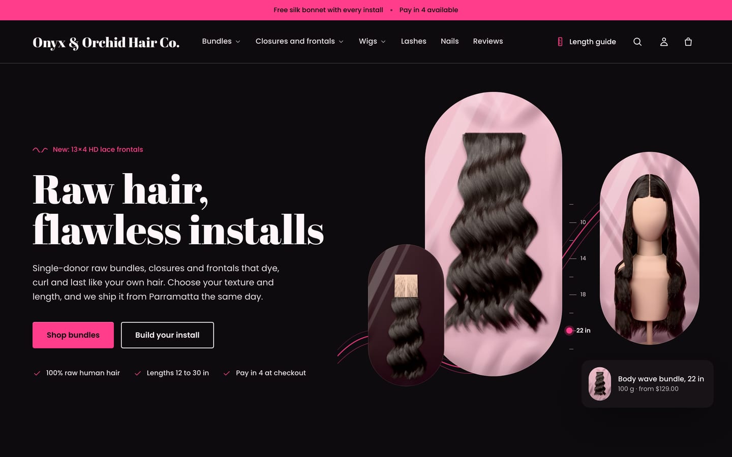
Tress
For hair extensions, closures, frontals and wigs, with a mirror trio hero with a length ruler and a product tag, Shop by texture mirrors, best sellers, Build your install, the Length guide spotlight, a wigs rail, testimonials, Install of the week in five staggered mirrors and a newsletter on the hot‑pink band.
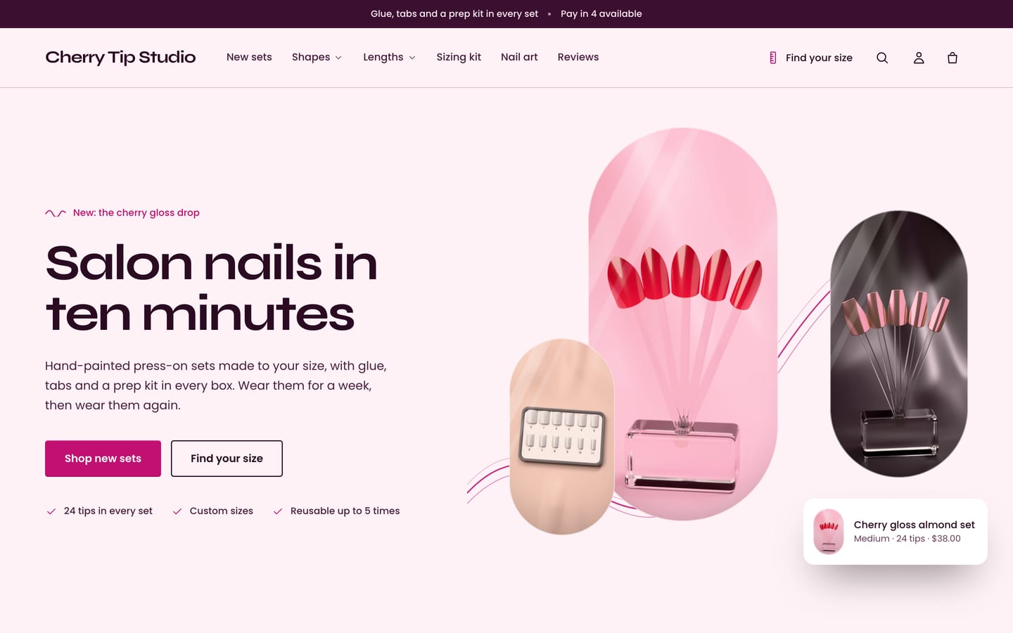
Lacquer
For press‑on nails, with a mirror trio hero (“Salon nails in ten minutes”), Shop by shape (drawn nails until your photos are in), new sets, a sizing kit story, Apply in 3 steps, testimonials and a newsletter.
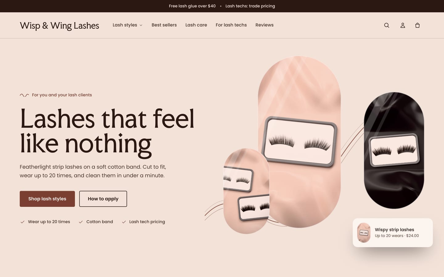
Flutter
For strip lashes, lash brands and lash techs, with a mirror trio hero (“Lashes that feel like nothing”), Find your lash style, “Wear up to 20 times”, best sellers, Lash care in three steps, a trade panel for lash techs, testimonials and a newsletter.
Built for the questions in your inbox.
All four are built in, with no app. The length scale, texture chips, glossary, nail chips and sizes come from your product options; hair details, care steps and install weights read product metafields that you set up once. Until that data is there, those parts stay hidden from shoppers or show plain buttons, so nothing shows half‑empty.
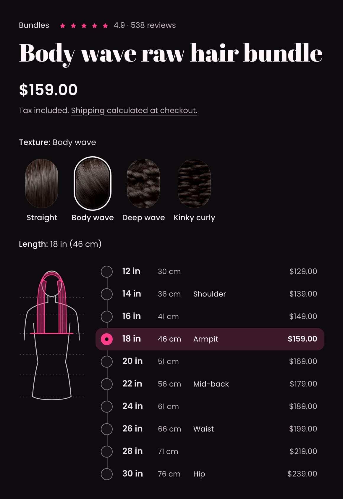
Length and texture picker
A Length option shows as a length scale instead of small buttons: every length in inches with centimetres beside it, the landmark it reaches (shoulder, armpit, mid‑back, waist, hip; you set the numbers) and its price, beside a line‑drawn figure whose hair grows or shortens to the length picked. Sold‑out lengths are struck through and skipped, and the scale is a real radio group for keyboard and screen reader users. A Texture option shows as tall texture chips, pictured from your Shopify swatches, from your own photos, or drawn by the theme. An (i) button beside Lace, Density, Grade and Cap size opens a glossary in plain words that you write once, and a Length guide section and a length chart page template show the figure large.
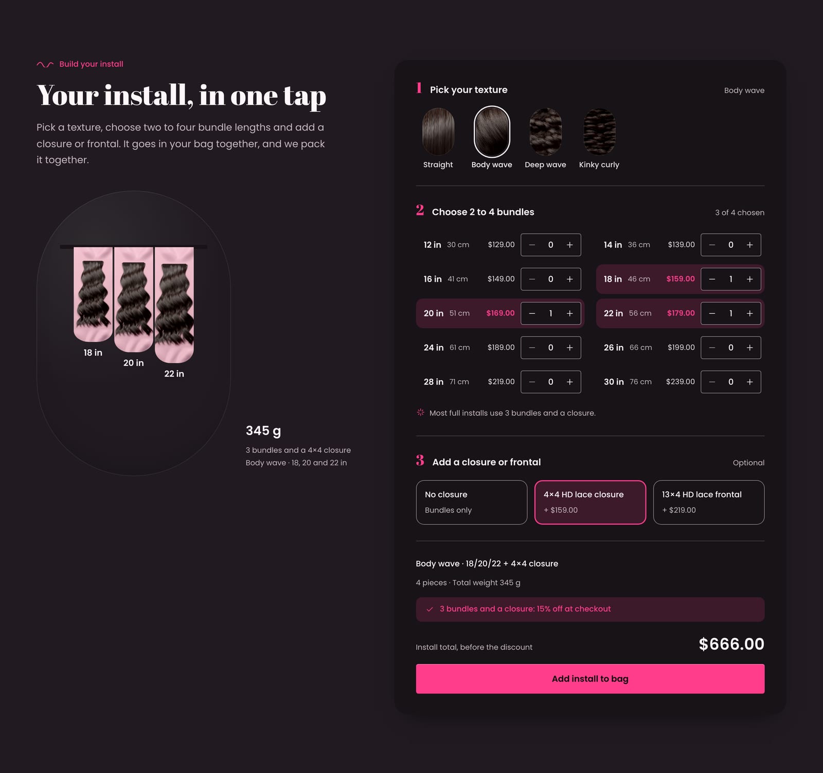
Build your install
Shoppers pick a texture, choose two to four bundle lengths with steppers and add a closure or frontal if they like, see the total price and total weight as they go, and add the whole install to the bag in one tap. The bag keeps the pieces together as one install, with an install total and Remove install, and each line carries an Install label (“Body wave · 18/20/22 + 4×4 closure”) through to the order, so you can pack it together. A deal line (“3 bundles and a closure: 15% off at checkout”) turns into a ticked pill when the install qualifies; the discount itself is an automatic discount you create in Shopify.
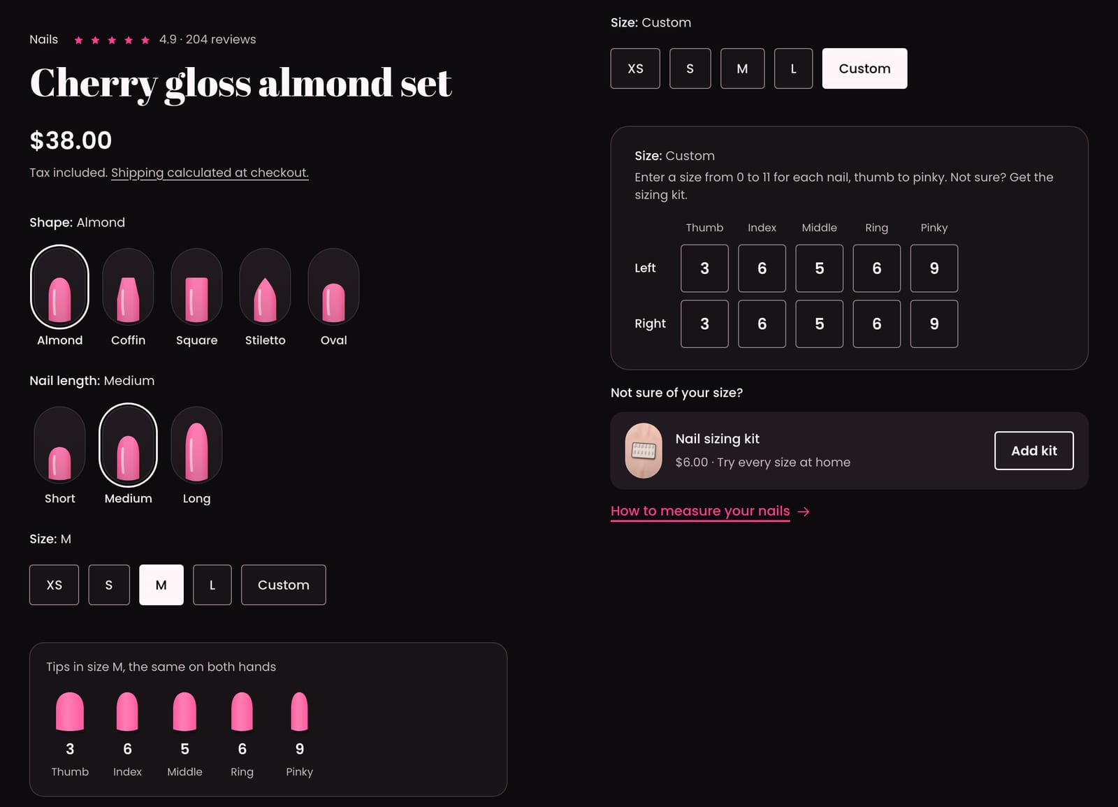
Nail shape and size
Shape and Nail length options show as drawn nail chips (almond, coffin, square, squoval, stiletto, oval and round, from short to extra long) that redraw as shoppers choose. Each standard size shows its five tip numbers, and a Custom size opens ten fields, left and right hand, thumb to pinky, sizes 0 to 11. Letters, out‑of‑range numbers and bad pastes are refused with a message, never cut short, and Buy it now stays hidden until all ten sizes are valid, so custom sizes always reach the order. Choose a sizing kit product for a “Not sure of your size?” row with an Add kit button, next to a How to measure your nails guide with your tip widths.
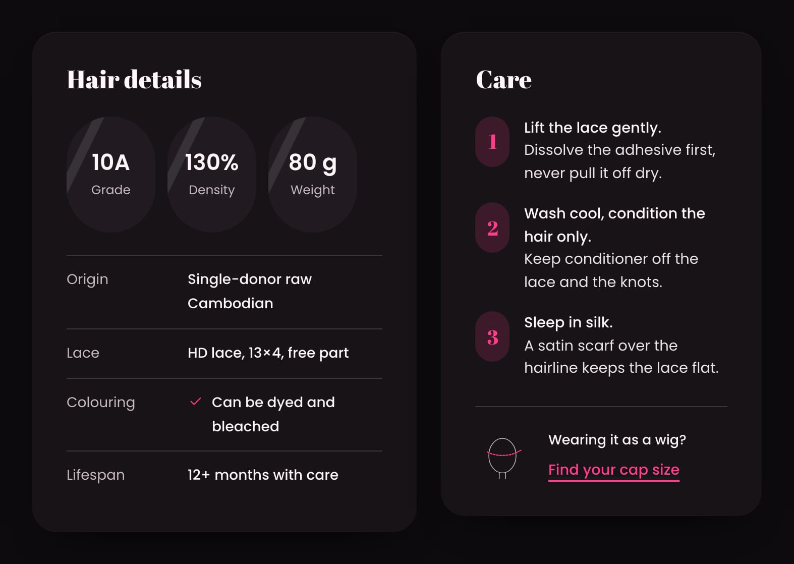
Hair details, care and a wig cap guide
A hair details label under the photos, with grade, density, weight and wears as stat pills, then origin, weight per bundle (following the chosen length), lace, cap size, density, coloring (“Can be dyed and bleached”), lifespan and wears, all from simple product metafields. Care steps sit beside it in numbered capsules, per product or one default for all. For wigs, a Find your cap size guide turns a head measurement in cm or inches into a cap size from your own table, and its Choose button picks that size on the product.
What’s in the theme.
Everything below ships in version 1.0.0, and the documentation covers every section and setting.
Pages and sections
- An announcement bar on the bold band with two messages on one line, messages taking turns, and an optional countdown to a real deadline
- A one‑row header with a mega menu (columns, a row of texture chips and capsule promos), a Length guide link with a ruler icon and search with live suggestions, sticky when shoppers scroll up; a long shop name wraps onto two lines on phones
- Hero: mirror trio, single mirror or full‑width image
- Slideshow, featured collection (grid, carousel or rail with copy), featured product, collection list as texture mirrors, Build your install and prebuilt kits, Length guide, image with text (or five staggered mirrors), icon row or numbered steps, shop the look with hotspots, as seen in, testimonials, FAQ, newsletter, blog posts, rich text and custom Liquid
- Length guide, contact and compare page templates, a 404 page and a password page
Product page
- A mirror‑pair gallery with zoom, video and 3D models
- The length scale, texture chips and glossary, nail chips and custom sizes, and the hair details label with care steps
- Add to bag with the price in it, a sticky add‑to‑bag bar, trust rows, collapsible rows, pickup availability and back‑in‑stock requests
- Pre‑orders, gift card recipients, and subscriptions with a subscriptions app
- Shopify’s installments message styled to fit small phones, on stores with Shop Pay Installments
- Nails and lashes product templates in every preset, so one store can sell hair, press‑ons and lashes, each with its own product page wording
Collections and search
- Product cards as capsule mirrors (or soft corners or square), with a quick‑add button on the capsule’s foot, a second image on hover, quick view and swatches
- A meta line (“12–30 in · Body wave”) and up to two badges (Save, Best seller, New, Most loved, Sold out)
- Filters with textures as small capsules and lengths in inches and cm, in a drawer on phones, that update without reloading the page
- Search with live suggestions: products, collections, pages and articles
- Compare up to three products
Cart
- Bag drawer and cart page with install groups and the install deal line
- An order note, a bag note and, when you set a threshold, a free‑shipping progress bar
Trade and B2B
- Quantity rules, volume pricing and a quick order list for Shopify’s B2B features
Accessibility and languages
- Every palette measured against WCAG AA contrast, the bold band and the gloss badges included
- Keyboard friendly: the length scale, chips, steppers, glossary and cap guide all work from the keyboard
- Motion that stops when visitors reduce it
- Right‑to‑left languages
At a glance.
- Version
- 1.0.0, an instant download from Etsy
- In the download
- Three theme files, one per preset (Tress, Lacquer and Flutter), a user guide (PDF, 51 pages) and a license for one store
- Built on
- Online Store 2.0
- Color palettes
- Four in one theme: Onyx, Nude, Candy and Chrome (three light, one dark)
- Fonts
- Abril Fatface and Poppins, Syne and Poppins, or Faculty Glyphic and Poppins, depending on the preset. Font pickers for headings and body text, a base text size and three page widths.
- You’ll need
- A Shopify store on any plan that can publish a theme, and a computer to upload it (phones can’t upload theme files). Filters and complementary product recommendations need Shopify’s free Search & Discovery app. The installments message under the price needs Shop Pay Installments switched on, where Shopify offers it.
- Your data
- The length scale, texture chips, glossary, nail chips and sizes come from your product options, once their names match the ones in Theme settings and every value fits (lengths must be numbers, like 18 in or 45 cm). Hair details, care steps, install weights and the short names in an install’s label read product and variant metafields that you set up once, with no app; the user guide lists each one. Landmarks, texture pictures, glossary definitions, cap sizes and tip numbers are short lists you type in Theme settings. The install deal line is text: create the discount itself as an automatic discount in Shopify. Custom nail sizes are checked in the shopper’s browser, so read them on the order before you make the set.
- Support
- Message us on Etsy or email hello@buglyph.com. We reply within two business days, Monday to Friday, Australian Eastern Time.
Documentation and support.
Documentation
Installing the theme, every section and setting, and setting up Tress’s data, chapter by chapter. The same guide comes as a PDF in the download.
Support
Questions, bugs and setup help. Message us on Etsy or email us. We reply within two business days, Monday to Friday, Australian Eastern Time.
Tress
Sold on Etsy as an instant download. Each purchase licenses one Shopify store.